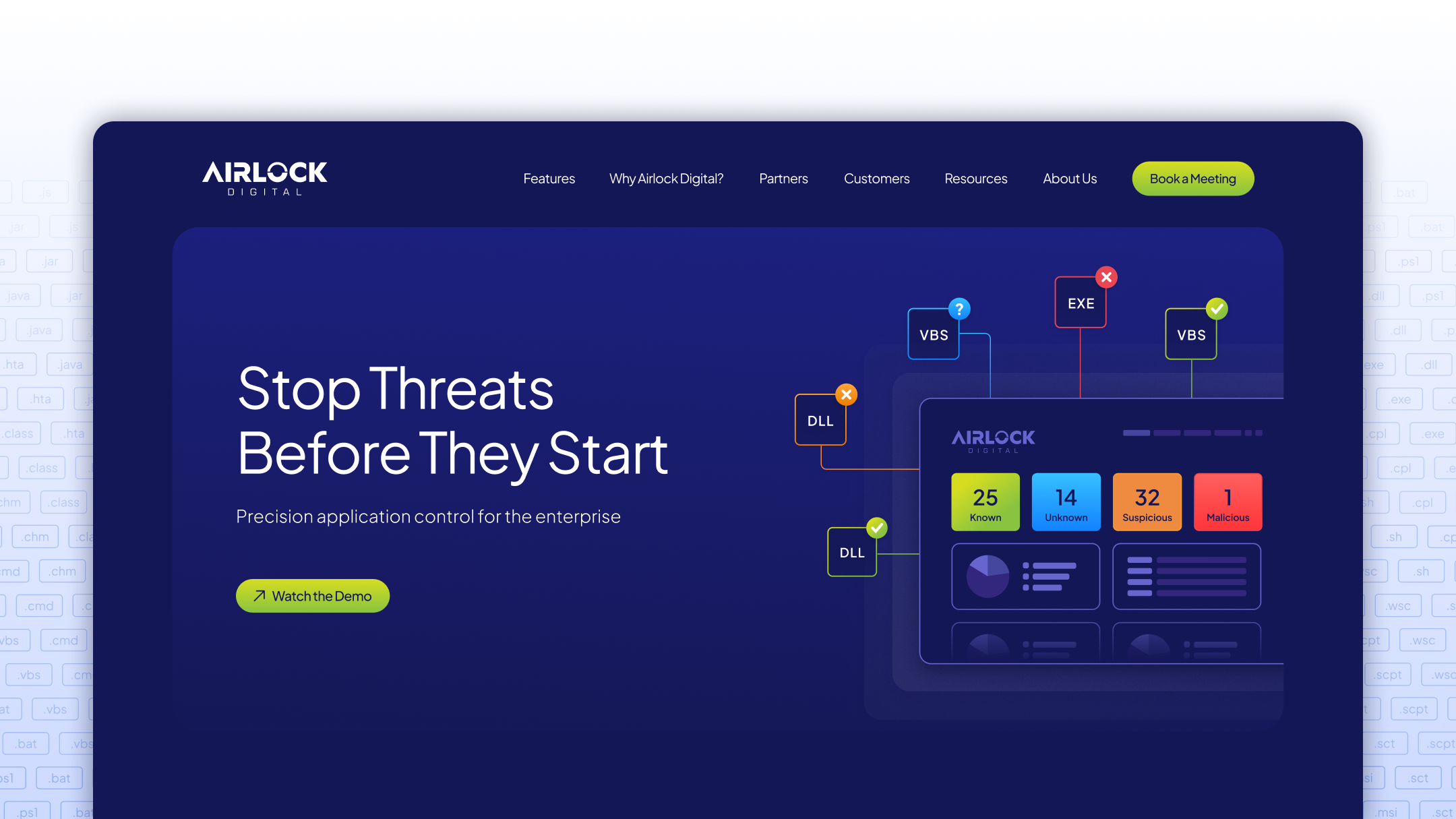
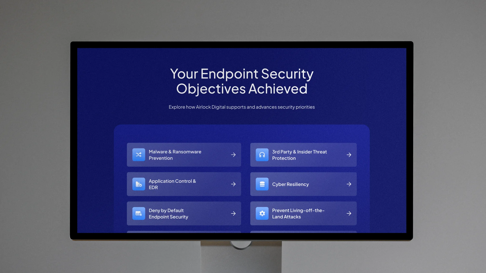
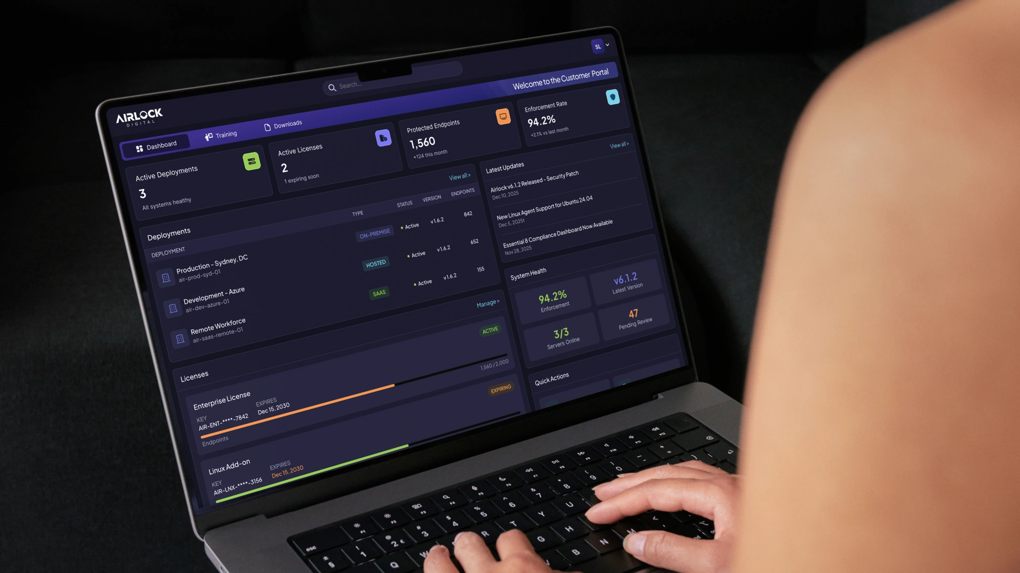
Visual design execution for Airlock Digital, an enterprise cybersecurity company based in Australia. Working within an established design system, the project focused on evolving the brand's visual language across web, social, print, and event materials toward a cleaner, more authoritative direction for a global enterprise audience. Deliverables spanned 70+ assets including resource library graphics, social content, datasheets, and event collateral.
Brand Evolution
Design System
Web & Digital Assets
Event Collateral
SaaS
B2B
Visual design support for Airlock Digital, an enterprise cybersecurity company based in Australia. Working within an established retainer model, the work covered a broad range of touchpoints: web graphics, social content, datasheets, event banners, booth graphics, and print materials, maintaining brand consistency across a high volume of assets each month.
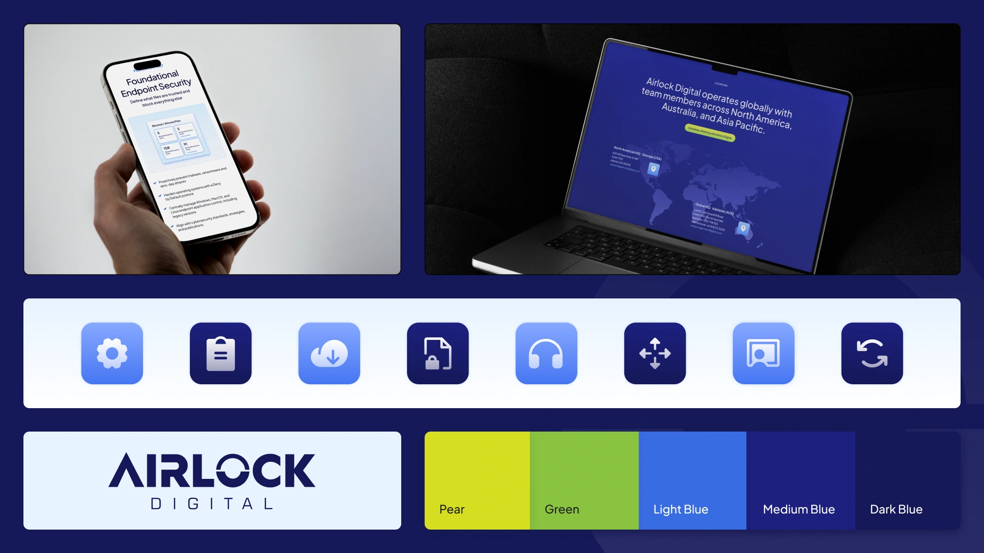
With a defined retainer scope, the challenge was delivering a large number of polished, on-brand assets within a fixed monthly timeline. Social graphics, case study thumbnails, and datasheets were regularly produced in batches of ten or more, requiring a disciplined approach to maintaining visual consistency at speed. The 70+ asset count is a conservative figure: in practice, a single deliverable type could account for a dozen variations in one cycle.
The visual direction shifted toward a cleaner, more corporate aesthetic over the course of the engagement: deeper blues, simplified gradients, and reduced decorative elements. Working within these evolving guidelines meant continuously recalibrating the system while keeping existing assets coherent.
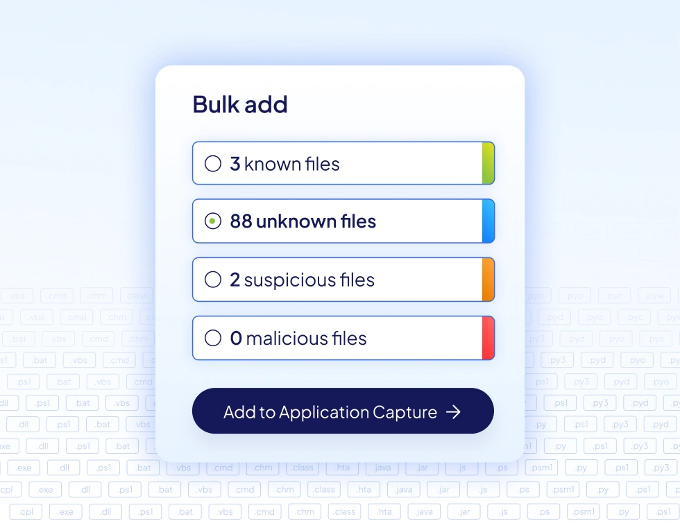


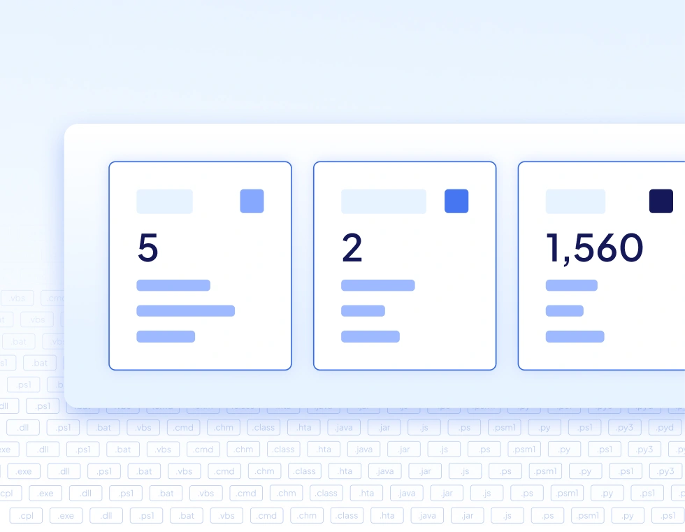
The client's visual direction shifted toward a cleaner, more corporate aesthetic over the course of the engagement: deeper blues, simplified gradients, and reduced decorative elements. Adapting to these evolving guidelines while keeping the broader asset library coherent was an ongoing part of the work.
A sustained visual presence across web, social, event, and print, supporting a global enterprise brand through an active growth period.